

A clear, comfortable reading experience often comes down to the font on the page. Some typefaces make text feel smooth and effortless to read, while others can make the same words feel crowded or tiring after only a few lines.
Certain fonts appear again and again in documents, websites, and presentations. Names like Arial, Verdana, Helvetica, and Calibri are frequently recommended, but simply listing them does not explain why those fonts tend to work better.
From what I’ve seen, the real difference usually comes from how easily the brain can recognize letter shapes and move across lines of text. When those patterns are clear, reading feels natural. When they are not, even simple text can start to feel harder to process.
So instead of only listing fonts, let’s understand the design features behind readability. Once you see those patterns, the most recommended fonts will start to make sense.
What Are the Easiest Fonts to Read
Certain fonts show up again and again when people talk about readability. They appear in websites, documents, presentations, and printed materials because they stay clear across many reading situations.
That consistency is not random. These fonts share structural traits that help the brain recognize words quickly and keep the eye moving smoothly across lines of text.
Common Fonts Widely Considered Easiest to Read
These fonts consistently appear in readability discussions:
- Arial
- Verdana
- Helvetica
- Calibri
- Roboto
- Open Sans
- Georgia
Each of these fonts relies on similar readability features.
For example:
- Verdana uses wider spacing and larger letter shapes, which keeps text clear on screens.
- Arial keeps letter shapes simple and balanced, helping readers move through words quickly.
- Roboto and Open Sans were built for digital interfaces, so they remain readable across many screen sizes.
Although these fonts look different at first glance, they rely on the same basic principle: clear letter recognition.
| Font | Best Use | Accessibility Support | Sample |
|---|---|---|---|
| Arial | General reading | Standard readability | The quick brown fox jumps over the lazy dog. |
| Verdana | Screens and web text | Good for low vision | The quick brown fox jumps over the lazy dog. |
| Helvetica | Design and branding | Standard readability | The quick brown fox jumps over the lazy dog. |
| Calibri | Documents and presentations | Standard readability | The quick brown fox jumps over the lazy dog. |
| Roboto | Digital interfaces | Good for modern UI | The quick brown fox jumps over the lazy dog. |
| Open Sans | Website body text | Good accessibility support | The quick brown fox jumps over the lazy dog. |
| Georgia | Long-form reading | Good paragraph clarity | The quick brown fox jumps over the lazy dog. |
| Lexend | Reading speed optimization | Helpful for dyslexic readers | The quick brown fox jumps over the lazy dog. |
| OpenDyslexic | Dyslexia-friendly reading | Designed for dyslexia support | The quick brown fox jumps over the lazy dog. |
| Atkinson Hyperlegible | Low vision readability | Designed for visual accessibility | The quick brown fox jumps over the lazy dog. |
Sans-serif Fonts Most Often Recommended
Sans-serif fonts appear most often in readability advice.
These fonts remove the small decorative strokes called serifs. With fewer visual details, the letter shapes remain clearer on digital screens where fine edges can blur.
Common examples include:
- Arial
- Helvetica
- Calibri
- Roboto
- Open Sans
Because the shapes are simpler, the eye processes them quickly. This becomes especially helpful on phones and laptops where text is often smaller.
That said, simplicity alone does not guarantee readability. Some minimalist fonts still create confusion when letters look too similar to each other.
Readable Serif Fonts Used for Long Text
Serif fonts include small strokes at the ends of letters. Many people assume those strokes make reading harder, but that assumption does not always hold.
Some serif fonts are extremely comfortable for longer passages.
Examples include:
- Georgia
- Merriweather
These fonts maintain open shapes and balanced spacing, which helps keep text comfortable to read across paragraphs or pages.
In printed materials, those serif details can even guide the eye along lines of words.
What Actually Makes a Font Easy to Read

Lists of readable fonts are useful, but they do not explain the deeper reason behind readability.
The real factor lies in how the brain processes written language.
Reading is not simply recognizing letters one by one. Instead, the brain quickly identifies patterns of letters that form familiar word shapes.
The Difference Between Legibility and Readability
Two related terms are often confused: legibility and readability.
Legibility refers to how easily individual characters can be recognized. For example, legibility becomes poor when characters look almost identical:
- lowercase l
- uppercase I
- number 1
A legible font clearly separates these characters.
Readability, on the other hand, refers to how comfortable it is to read longer passages of text.
A font might have perfectly legible letters but still feel tiring after a few paragraphs if spacing or rhythm is off.
How the Brain Recognizes Letter Shapes During Reading
When you read, your eyes move in small jumps called saccades. During each pause between those movements, your brain processes clusters of letters at once.
That means readers often recognizeentire word shapes, not just individual characters.
Fonts that support this process usually include:
- consistent character shapes
- predictable spacing
- stable letter proportions
These features allow the brain to identify words quickly and almost automatically.
When fonts disrupt those patterns with unusual shapes or cramped spacing, recognition slows down. Over time, that extra effort makes reading feel tiring.
Why Font Structure Influences Reading Speed and Comfort
Font structure determines how smoothly your eyes move through text.
When letters are clear and evenly spaced, your brain spends less effort decoding them. As a result, more attention goes toward understanding meaning.
When the structure is poor, the opposite happens. Your brain must repeatedly pause to identify characters, interrupting the natural flow of reading.
That difference explains why some fonts remain comfortable across pages while others become exhausting after a few lines.
Key Design Features that Improve Font Readability
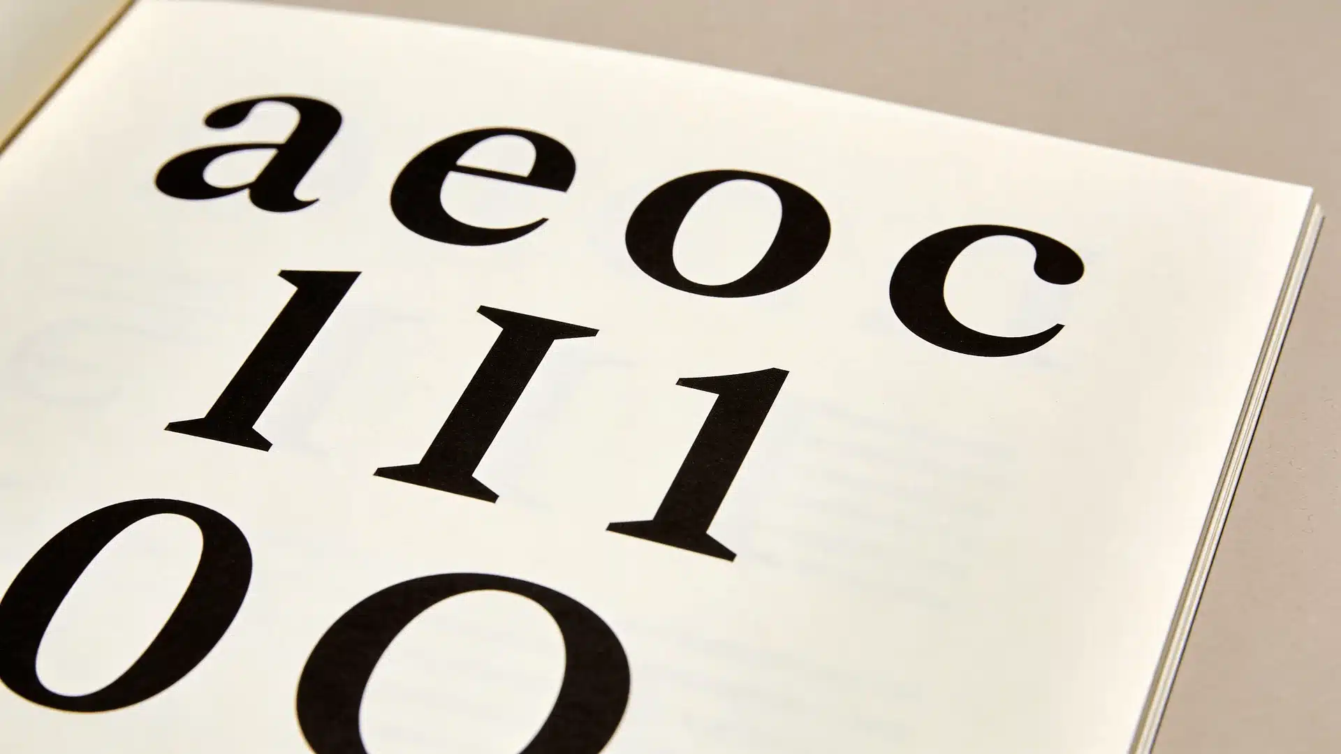
Readable fonts tend to share several structural features. These design elements shape how easily the eye recognizes letters and how smoothly the brain processes words.
Once you notice these patterns, the reason certain fonts keep appearing in recommendations becomes much clearer.
Large X-Height and Balanced Letter Proportions
The x-height refers to the height of lowercase letters, such as:
- x
- a
- e
- n
Fonts with larger x-heights often feel easier to read because the lowercase letters appear bigger without increasing overall font size.
Verdana illustrates this well. Its larger lowercase letters help maintain clarity even at smaller sizes.
Balanced proportions also matter. Letters that are extremely tall, narrow, or compressed can disrupt word recognition and slow reading speed.
Open Counters and Clear Letter Shapes
Counters are the open spaces inside letters. Examples include:
- o
- e
- a
- c
When those spaces remain open and visible, letters stay clearer.
If counters become too small or closed, letters can blur together. Recognition becomes slower, and visual strain increases.
Readable fonts keep generous internal spacing so characters remain distinct.
Letter Spacing and Reading Rhythm
Spacing between letters plays a major role in readability.
- If letters sit too close together, words appear crowded and the brain must work harder to separate them.
- If spacing becomes too wide, words lose their visual cohesion.
Readable fonts balance spacing so that letters stay distinct while words remain visually connected. This balance creates a smooth reading rhythm across lines of text.
Distinct Characters that Prevent Confusion
Readable fonts design characters so they cannot easily be mistaken for one another.
For instance, these pairs commonly create confusion:
- l vs I
- 0 vs O
- 1 vs l
Fonts optimized for readability make sure these characters look clearly different. That distinction becomes especially important in long passages or technical content.
Why Some Fonts Work Better on Screens While Others Work Better in Print

Many people notice that a font can look excellent in print but feel less comfortable on a screen. The reason lies in how screens and printed pages display text.
Why Sans-serif Fonts Often Perform Better on Digital Screens
Screens display letters using pixels. When fonts include fine details, those details can blur depending on resolution.
Sans-serif fonts avoid this issue because their shapes are simpler.
Fonts such as Arial, Roboto, and Open Sans keep letter outlines clean and smooth. As a result, they remain readable even on smaller screens.
Why Serif Fonts Can Improve Readability in Printed Text
Printed text usually has much higher resolution than digital displays.
Because of that, serif details remain sharp and visible.
Those small strokes can help guide the eye along a line of text, which often makes longer printed passages easier to follow.
This is one reason books and newspapers frequently rely on serif fonts.
How Resolution and Rendering Affect Letter Clarity
Another factor is font rendering.
Digital systems adjust how letters appear to match screen resolution. Some fonts are specifically designed to perform well with these adjustments.
Verdana and Roboto are good examples. Both were developed with screen readability in mind, which helps them stay clear across devices.
Accessibility Fonts Designed to Improve Reading Clarity
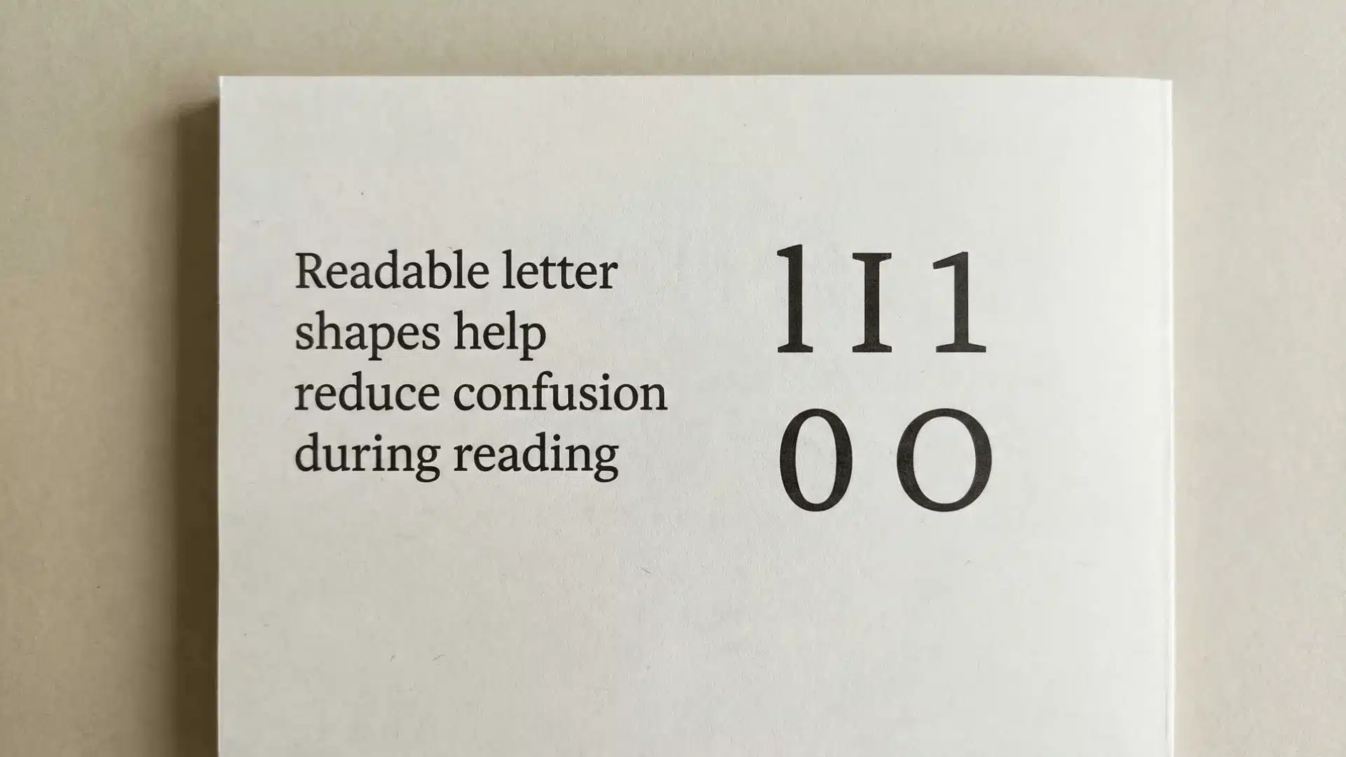
Some fonts are created specifically for readers who struggle with standard text. These fonts adjust character shapes, spacing, and proportions to improve recognition.
Fonts Designed for Low Vision Readers
Fonts designed for low vision focus on strong character differentiation.
Atkinson Hyperlegible is a good example.
This font exaggerates differences between characters so they cannot easily be confused. Letters like “I,” “l,” and “1” appear clearly distinct.
These adjustments make text easier to interpret for readers with visual limitations.
Fonts Designed to Support Dyslexia
Some fonts attempt to support readers with dyslexia. Examples include Lexend and OpenDyslexic.
These fonts modify spacing, letter weight, and shape structure to reduce visual confusion. For certain readers, these changes can improve reading speed and comprehension.
Wrapping Up
Choosing the easiest font to read becomes simpler once you understand what makes text readable in the first place.
Clear letter shapes, balanced spacing, open counters, and distinct characters all help the brain recognize words more quickly. That is why fonts like Arial, Verdana, and Roboto appear so often in readability recommendations.
Instead of searching for one perfect font, think about readability as a set of design principles. When those principles are present, reading becomes smoother, faster, and far more comfortable.
Frequently Asked Questions
What font is easiest on the eyes?
Fonts with clear shapes and balanced spacing are usually easiest on the eyes. Arial, Verdana, Roboto, and Open Sans remain popular because they maintain clarity across screens and documents.
Is Calibri or Arial easier to read?
Both fonts are readable. Calibri has softer curves and slightly wider spacing, while Arial uses sharper shapes. Many readers find Calibri smoother for longer text.
What font is easiest to read for elderly people?
Fonts with larger letter shapes and clear spacing usually work best. Verdana and Arial are common choices because their characters remain distinct even at smaller sizes.
What font is easiest to read for ADHD?
Fonts with consistent spacing and stable shapes can help maintain focus. Open Sans, Arial, and Lexend are often preferred because their characters remain visually clear.