

People treat AI art styles as a selection menu: pick one, paste it in, and hope for the best.
But the difference between a prompt that produces exactly what you pictured and one that goes sideways usually comes down to understanding why a style term does what it does.
That understanding changes how you prompt entirely.
Here you’ll find a breakdown of every major style category, how artist references work, and how to structure your prompts so the model actually listens.
What are AI Art Styles?
AI art styles are prompt descriptors that tell an AI image generator how an image should look and not just what it should show.
When you add a style term to your prompt, you’re influencing texture, color temperature, lighting, linework, and mood all at once. It’s not a filter applied after the image is made.
That’s why the same subject looks fundamentally different under different style keywords.
AI models are trained on massive labeled datasets. A style keyword like “watercolor” or “cinematic” carries a cluster of visual associations the model learned from thousands of tagged examples. It applies all of them together, not one setting at a time.
Different Art Styles for AI
The styles below are grouped by their visual similarities. Find the look you’re going for, and you’ll find the right category.
1. Photorealistic and Hyperrealistic Styles
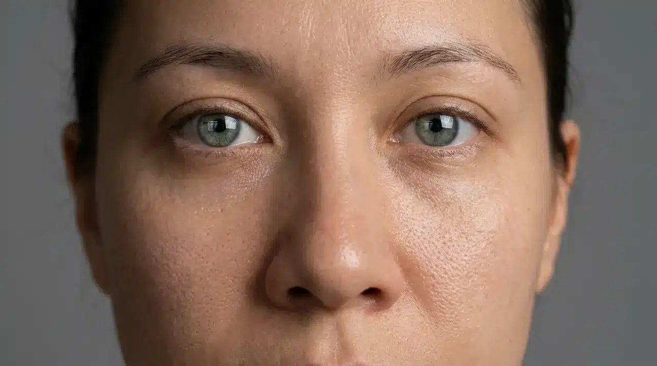
These styles push AI output as close as possible to real photography. Photorealism targets natural, camera-accurate results. Hyperrealism goes further, sharpening detail beyond what a lens would actually capture.
Both styles prioritize accurate lighting, skin texture, surface reflections, and depth of field. They work best for portraits, product visuals, and architectural renders. This is one of the less stable categories, so testing across platforms is worth doing before committing to a workflow.
2. Cinematic and Film-Noir Styles
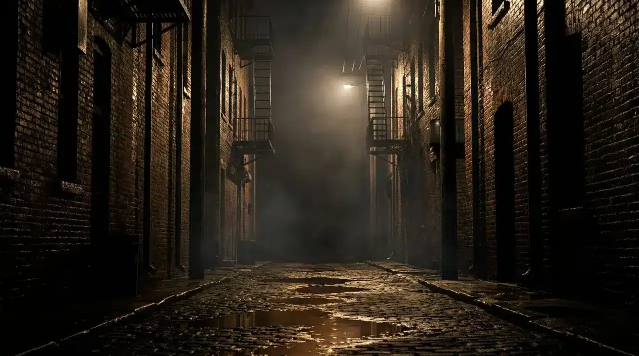
Cinematic style isn’t about realism; it’s aboutfeeling like a frame from a film. Think rim lighting, wide aspect ratios, atmospheric haze, and the kind of color grading you’d see in a thriller or prestige drama.
Film noir sits within this family but pulls toward high contrast, deep shadows, and a cool or monochrome palette. Results can shift noticeably between models, so the same prompt may need slight adjustments depending on the tool you’re using.
3. Oil Painting and Baroque Styles
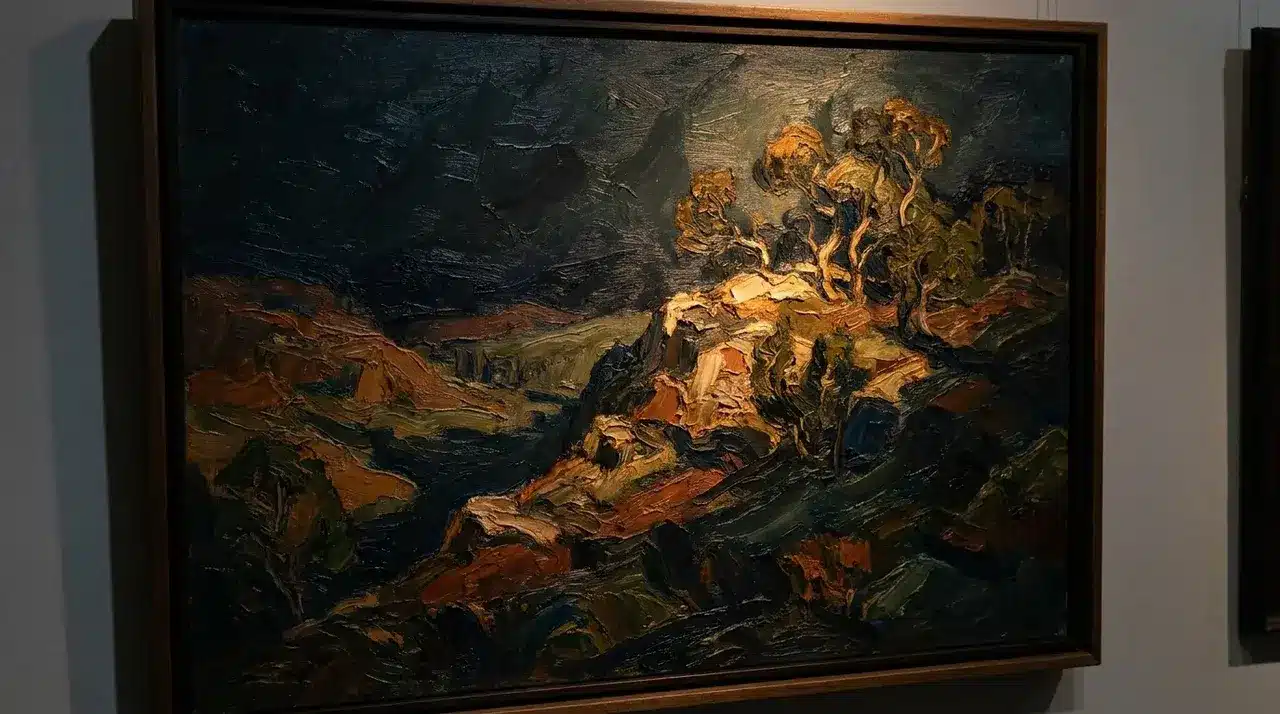
Oil painting, as a style keyword, reliably evokes thick, visible brushwork, rich color depth, and a sense of physical texture. Baroque narrows that further expect dramatic contrast, deep shadows, and compositions that feel weighty and staged.
These styles are among the most stable across major models. The training data for classical painting is extensive and well-labeled, which means the output tends to be consistent.
They suit portraits, landscapes, and anything where you want a handcrafted, traditional feel.
4. Watercolor and Soft Illustration Styles
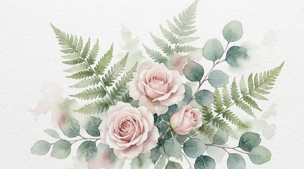
Where oil painting is dense and textured, watercolor is light and transparent. The defining visual properties are soft edges, visible paper texture, and colors that bleed into one another rather than sit in hard contrast.
This style works well for botanical illustrations, children’s book aesthetics, and anything requiring a gentle or organic feel. It’s distinct enough from other painted styles that mixing it with heavy-texture keywords often yields conflicting results.
5. Concept Art and Digital Painting Styles
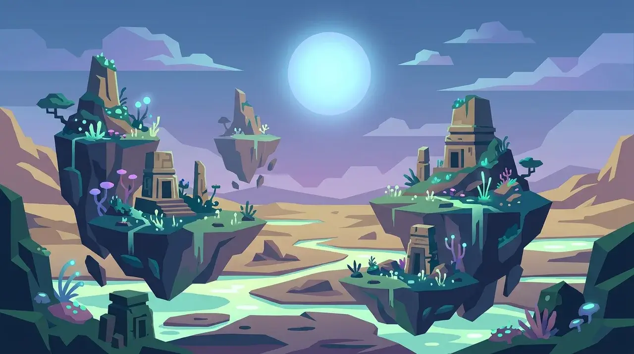
Concept art sits at the intersection of fine art and commercial design. It’s detailed, intentional, and built to communicate a scene or character clearly, not to mimic a traditional medium.
Digital painting is the broader category it belongs to. Both styles tend to produce structured compositions with defined light sources and deliberate color choices. They’re well-suited to character design, environment art, and game or film-adjacent visuals.
6. Anime, Manga, and Ghibli-Inspired Styles
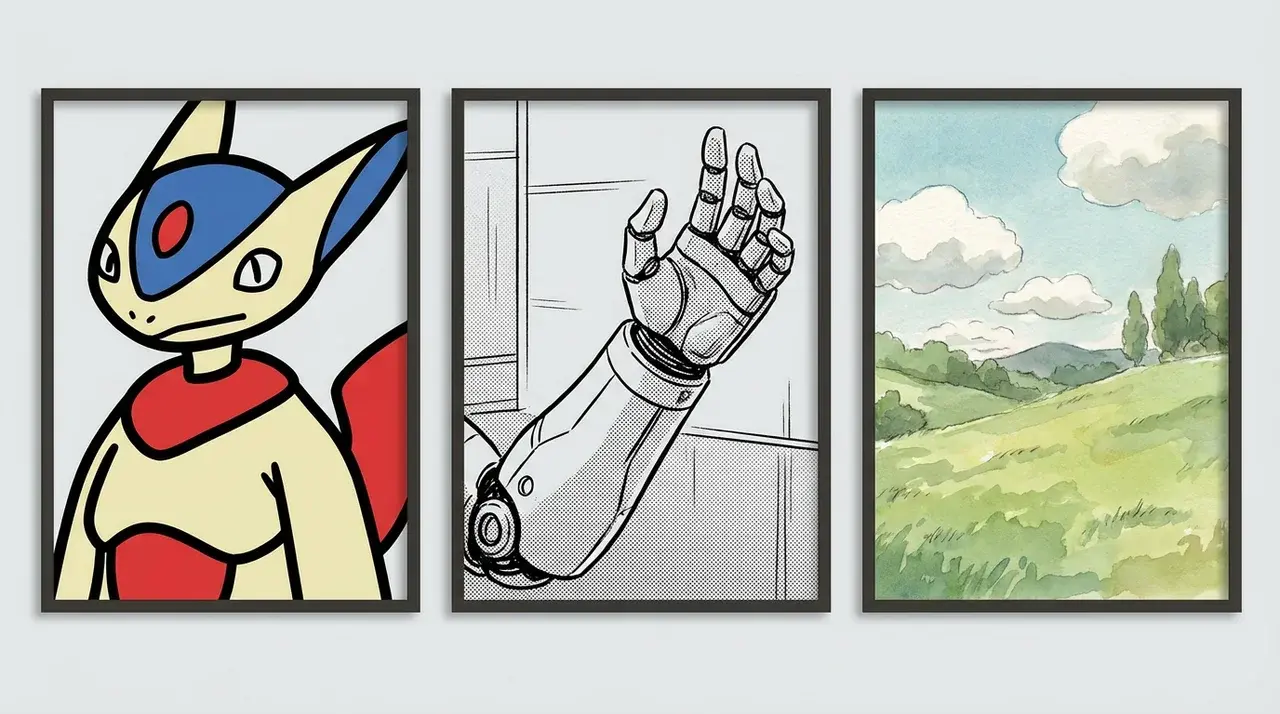
Anime as a style keyword produces bold outlines, flat color fills, expressive facial features, and high visual contrast. Manga pulls that toward black-and-white linework with screentone-style shading.
Ghibli-inspired is a more specific reference; it tends to produce softer colors, hand-painted backgrounds, and a warm, nostalgic atmosphere. Ghibli references can produce strong results but occasionally drift toward generic illustration if the prompt isn’t specific enough.
7. Surrealist and Dreamlike Styles
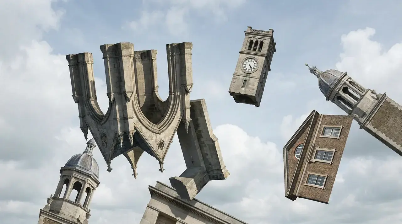
Surrealism in AI prompts produces imagery that follows its own internal logic, recognizable elements combined in ways that feel impossible or disorienting.
Think melting objects, impossible architecture, and figures in unexpected scales.
Dreamlike is the softer version: hazy, ethereal, emotionally ambiguous rather than jarring. Both styles respond well to abstract language in prompts.
They’re less subject-dependent than most categories; the style itself carries most of the visual weight.
8. Fantasy and Dark Fantasy Styles
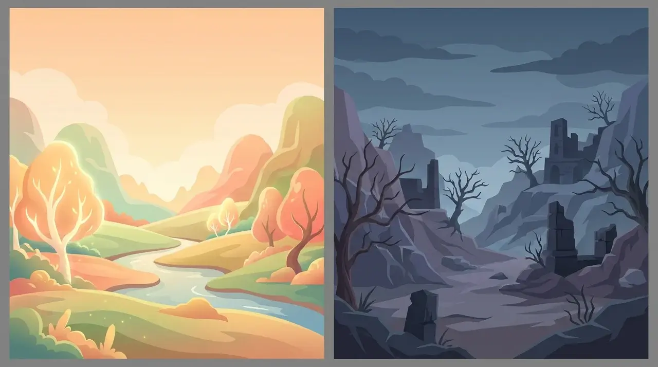
Fantasy style generates detailed, world-built imagery, creatures, landscapes, armor, and magic effects with a sense of internal coherence.
Dark fantasy shifts the palette and mood toward something more threatening: muted colors, heavier shadow, and subject matter that leans into danger or dread. This distinction matters in prompts using “fantasy” when you want dark fantasy, which often produces results that are too bright and heroic.
9. Cyberpunk and Sci-Fi Styles
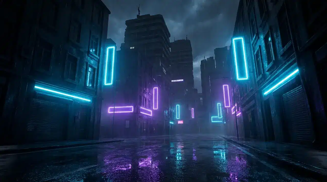
Cyberpunk is one of the most visually defined aesthetic clusters in AI generation. Neon lighting against dark environments, dense urban architecture, rain-slicked surfaces, and a palette that leans into electric blues and purples.
Sci-fi is the wider category; it includes clean, minimalist futures as much as dystopian ones. Specifying which end of the spectrum you want produces much sharper results. “Sci-fi” alone can pull in almost any direction depending on the model.
10. Art Deco and Art Nouveau Styles
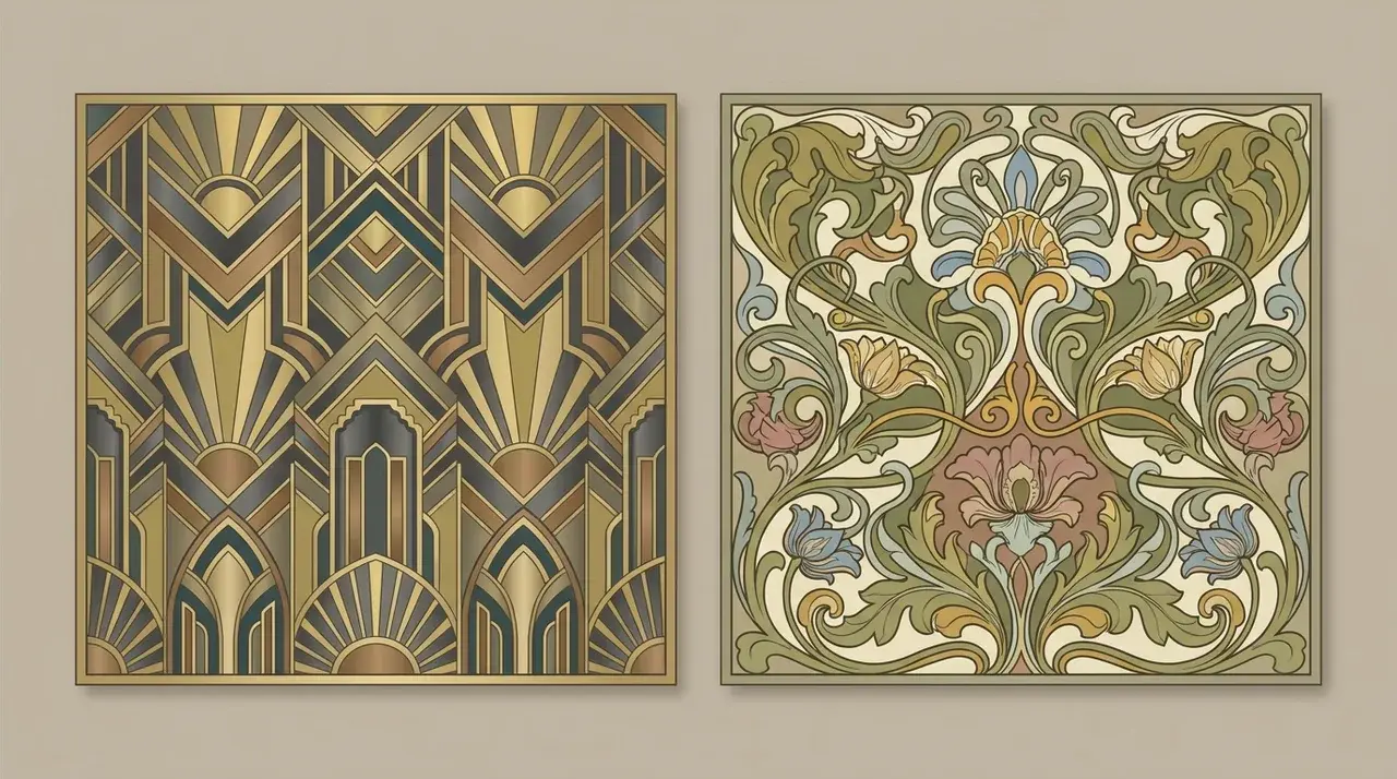
Art Deco produces geometric symmetry, bold lines, metallic tones, and the visual confidence of 1920s–30s design. Art Nouveau is its organic counterpart, with curved, plant-like forms, intricate linework, and a palette drawn from nature.
These are period-specific styles with strong visual identities. Both are well represented in the training data, making them reliable choices. They work particularly well for posters, architectural details, and decorative compositions.
11. Pixel Art and Retro Game Styles

Pixel art is defined by low resolution and visible square pixels; every detail is constructed deliberately from a limited grid. The aesthetic is inseparable from early video game hardware, which is exactly what gives it its appeal.
The visual rules are strict enough that the output tends to be consistent. It suits game assets, icons, character sprites, and anything with a nostalgic or retro-digital feel.
12. Minimalist and Flat Design Styles
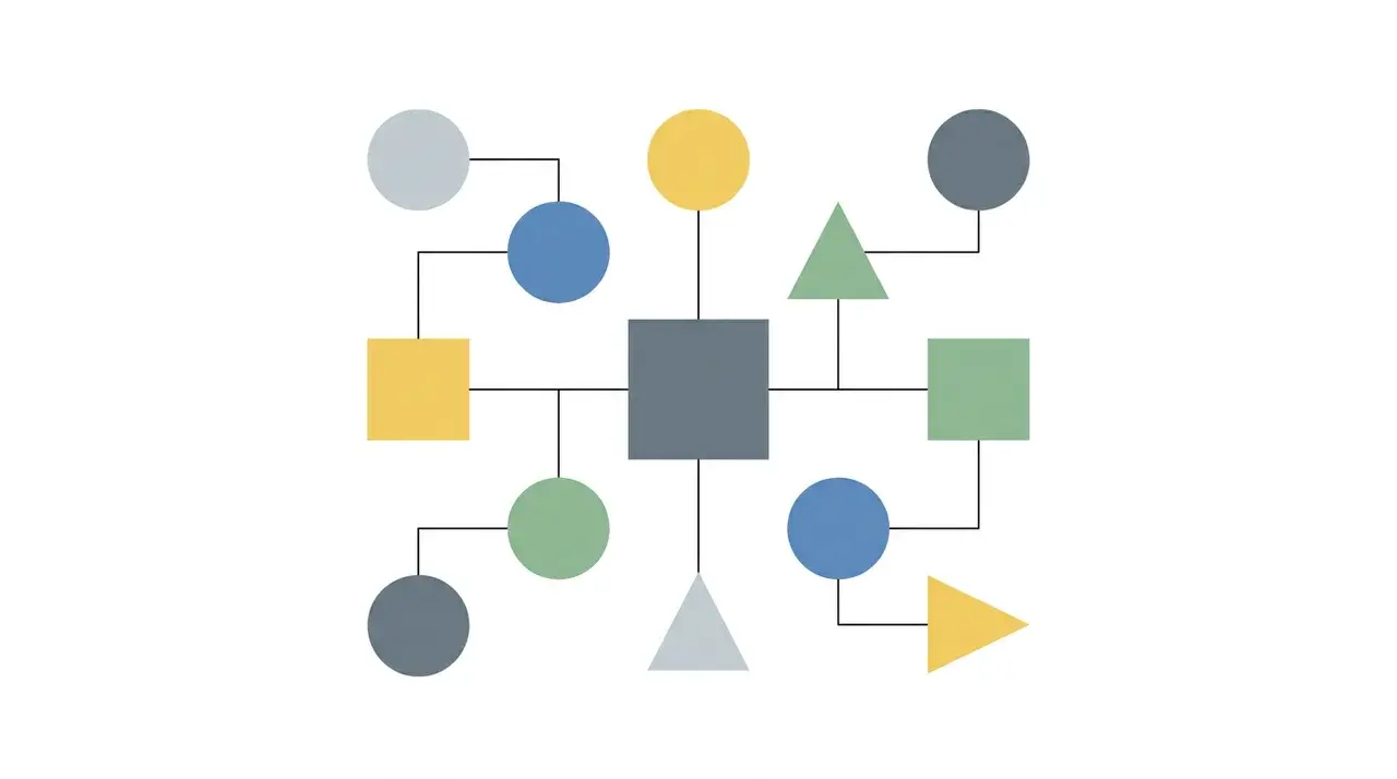
Minimalism in AI output means clean lines, limited color palettes, and compositions built around negative space. Flat design is a specific expression of that, with no gradients, no shadows, and no depth simulation.
It’s the visual language of modern UI and icon design. Both styles sit far from every painterly category on this list, which means they respond poorly to texture-heavy prompt language. Keep prompts spare to get clean results.
How do Artist and Period References Work Differently?
Artist names and style descriptors influence AI images differently. Broad terms like painterly or impressionistic reference large visual categories, which can lead to varied results.
Artist references such as Van Gogh give the model a specific visual target. It can apply recognizable brushwork, color choices, compositions, and artistic patterns more consistently.
This approach works best with well-known historical artists. Lesser-known creators may produce generic outputs because the model has fewer examples of their work.
How do Style Keywords Change What the Model Generates?
Style keywords influence image generation from the start. They guide the model in handling textures, colors, lighting, and composition before creating the final image.
When a style term appears in a prompt, the model draws on visual patterns learned during training. These associations shape the image’s overall appearance and artistic direction.
Specific terms like ukiyo-e woodblock provide clearer guidance than broad terms such as “artistic”. Abstract descriptors like “emotional” or “powerful” lack a consistent visual meaning.
For better control, use recognized art styles or artist references. The more specific and visually distinct the style term, the more reliable the output.
How to Use Style Terms in a Prompt?
How AI photo prompts shape the final image comes down to structure, a reliable sequence across most generators runs: subject, then style, then lighting or mood, then technical details.
A structure that works well across most AI image generators is:
Subject → Style → Lighting or Mood → Technical Details
For example, instead of writing “a portrait, realistic, cinematic, dramatic, 8k, detailed,” write “a portrait in a cinematic style, dramatic rim lighting, high detail.” Placing the style close to the subject gives it more influence over the final image.
Position also matters. Style keywords placed early in the prompt are typically weighted more strongly than those buried near the end.
For the best results, use one primary style and one supporting modifier. Combining too many styles can cause the model to blend them, reducing the impact of each.
Different AI tools process prompts differently, so adjusting the style, placement, and wording for your chosen generator can improve consistency.
Conclusion
Choosing the right AI art styles gets easier once you stop thinking of them as labels and start thinking of them as instructions.
Every term you add points the model toward a specific cluster of visual decisions, and the more precisely you point, the more predictable your results become.
Artist references narrow that target further. Prompt structure determines how much weight each element carries. Put these things together, and you’re not guessing anymore.
If you’re ready to go further, start experimenting with one style category at a time and build from there.
Frequently Asked Questions
Can AI art styles be combined in a single prompt?
Yes. Combining one primary style with one supporting style often works well, while adding too many styles can create inconsistent or diluted results.
Why does the same style prompt look different across AI image generators?
Different AI models are trained on different datasets, so they interpret style keywords differently and may produce noticeably different visual results.
Do AI art styles affect image quality or only appearance?
AI art styles influence appearance, detail levels, lighting, composition, textures, and the prioritization of visual elements throughout image generation.
Which AI art style is best for commercial projects?
There is no single best style. Photorealistic, flat design, and concept art styles are commonly used depending on project goals.
How can I create a unique AI art style instead of using preset styles?
Describe specific colors, textures, lighting, composition, and artistic influences instead of relying solely on generic style keywords.